Studio GUI
Touch User interface that controls a self recording green-screen studio
Role
Lead UX/UI Designer. In charge of designing user experience and graphical elements.
Overview
The Youstar Studio is a self recording room that any user in the University can utilize to record themselves. The system is equipped with a green-screen, professional recording lighting, camera and sounds system. The user only interacts with a control screen that with a simple graphic interface walks them through the different recording scenarios they would like to utilize; after the user selects their recording style the system automatically will be set up to the specified parameters and be ready for an hour long recording.
Users can record, pause and save their recording at any point. The user can bring their own devices to the room and utilize any media they wish to incorporate in their recording.
System Flow

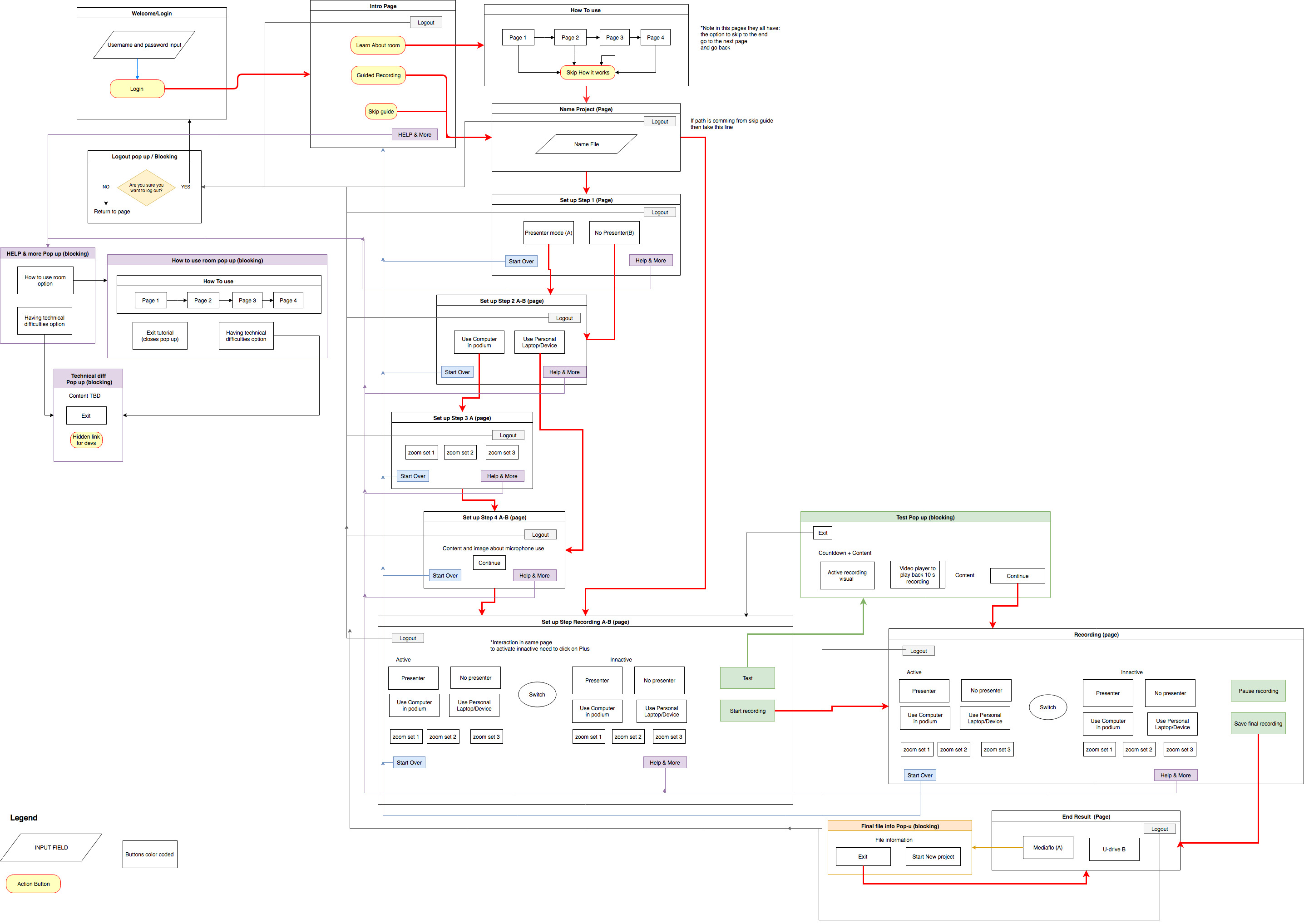
Starting with the initial requirements of desired functionality I worked with developers and users to determine a flow for the system. The chart above is what we determined the system should follow to create a simple and usable recording experience for any level of user.
Wireframes
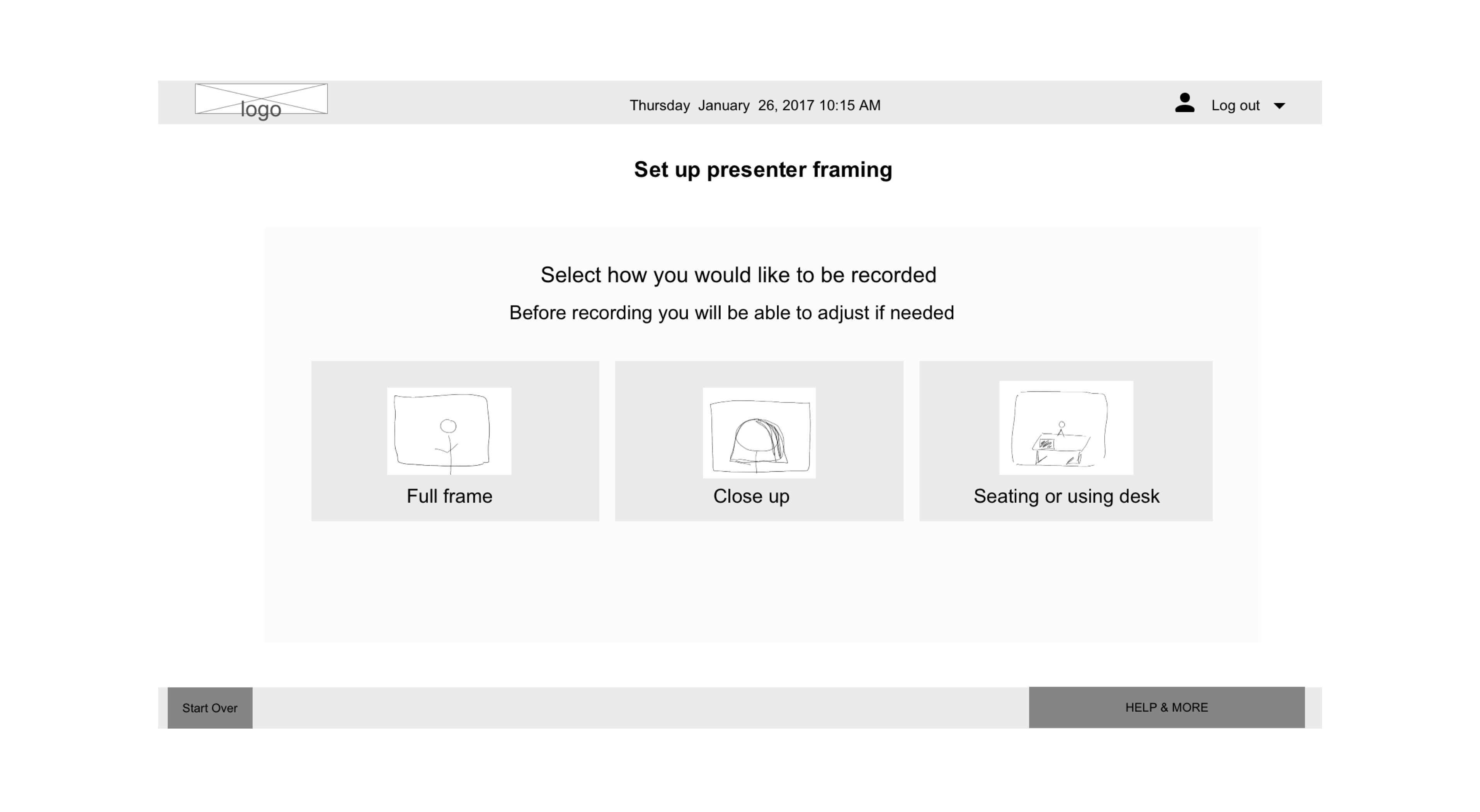
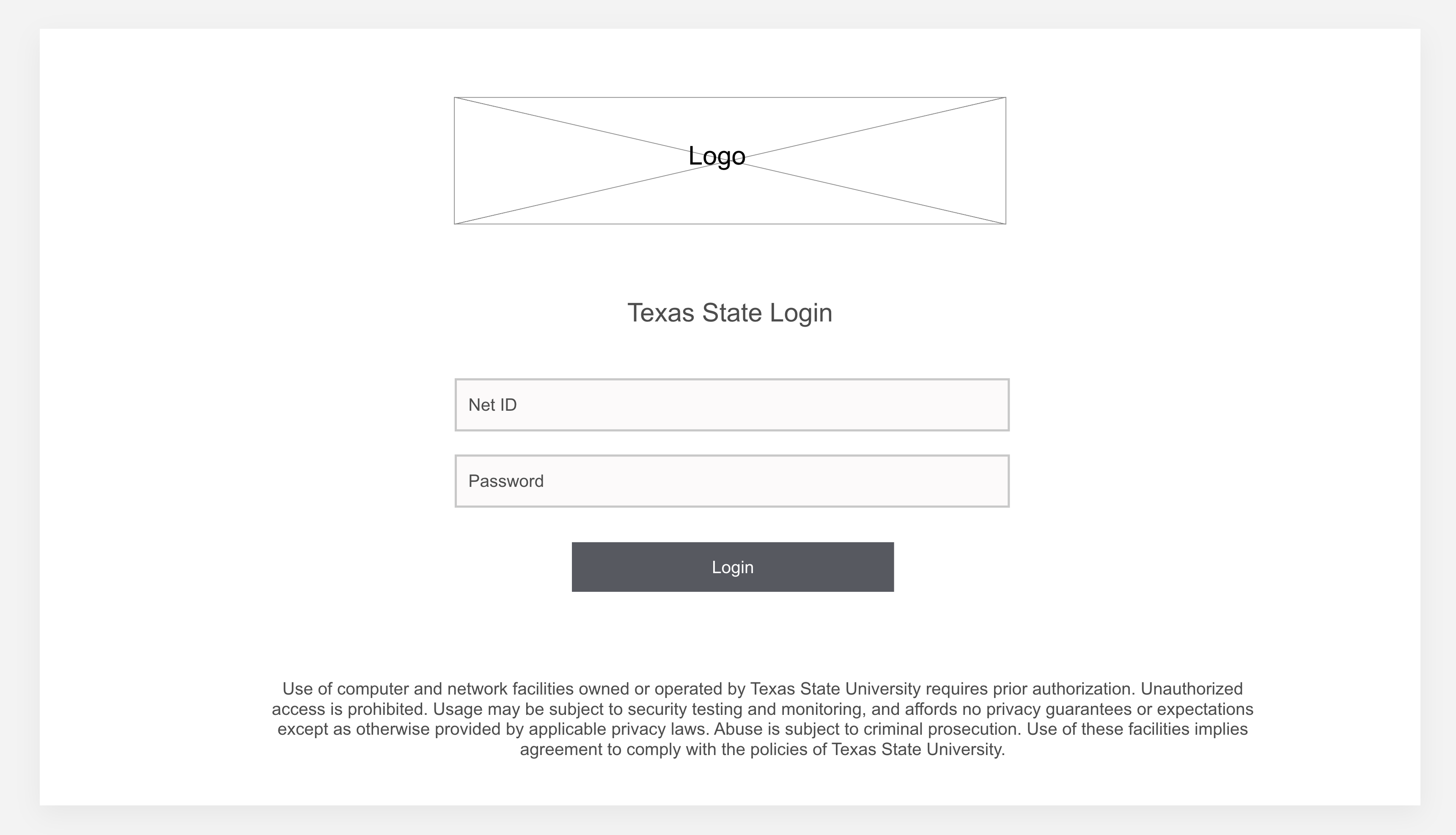
Once the desired flow was established I created paper wireframes with screens showing the functionality they would contain. The wireframes were shown to a group of users and adjusted into digital mockups where a more permanent place for items were established.

Usability Test
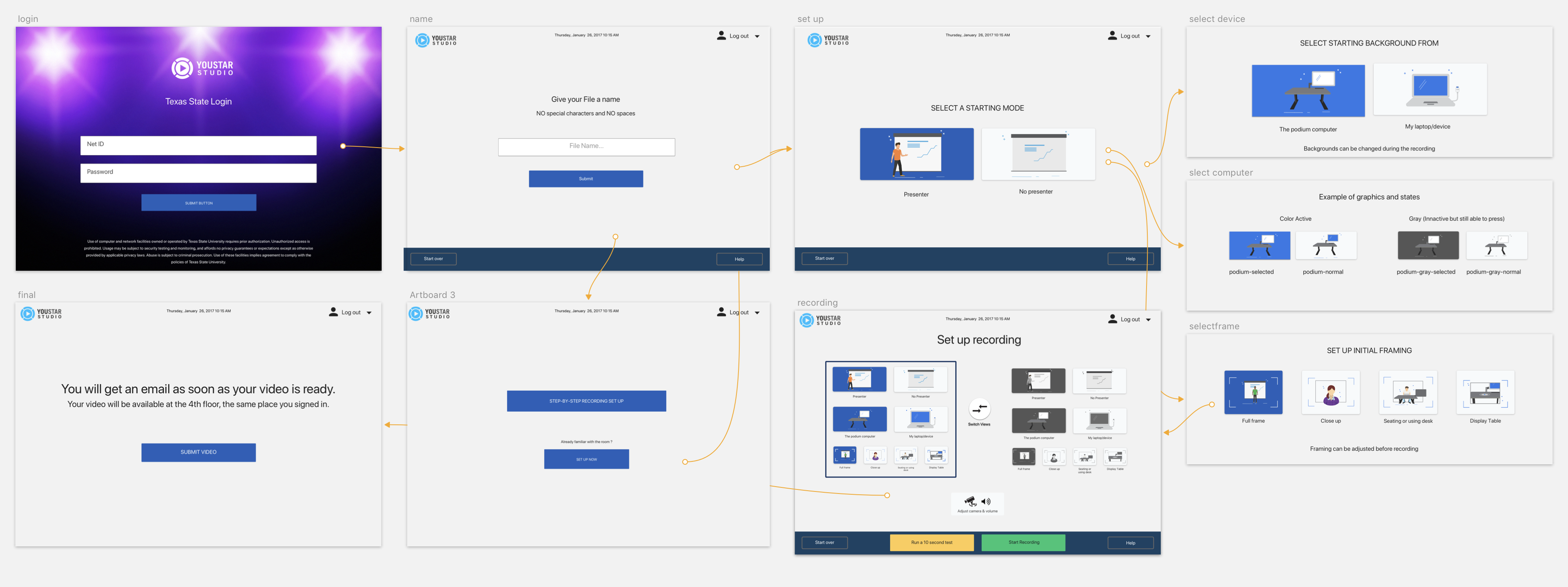
User testing was conducted with interfaces on a click through prototype, which was very helpful to gather feedback and see how users would interact with the interface. Users found the system easy to understand and any level of expertise could utilize the studio.

Click Through Prototype
Collaborating with Devs
In order to deliver design to developers I created a simple HTML CSS page where I could show elements, colors, typography and examples of interactions. Where code gaps existed, I created simple interaction videos to represent the desired action and communicated as detailed as possible so developers could implement. In this site I also attached the assets necessary so in delivering one web file all the elements were hosted in the same place.
By delivering assets in this manner it allowed us to communicate more clearly on what the desired design and interactions were for the project. The site was hosted on an internal site, but here is a copy of the file I provided. Youstar style guide
Final Design
The final design was implemented and has been used by students, faculty and staff at the University. To see a video of how is used please visit the Texas State University YouStar youtube video
