TRACS APP
iOS and Android application for the LMS at the university
Role
Lead UX/UI Designer. In charge of designing user experience and UI elements
Overview
TRACS is Texas State University's current Learning Management System for the student body. The TRACS app is designed to fit the students needs on a device, while maintaining full system functionality.
The project was initiated based on user feedback from students, that had a need to see or do specific functions within the LMS on their devices. The new design lets students quickly learned their grades, which is one of the elements they wanted to be able to access.
Requirements gathering
Based on the user testing feedback, we gathered that students had a need to access their current project grades more efficiently. The team combined the students feedback and the system data and chose the top most used tools on the LMS. These tools were included as the main features on the app, while still maintaining full system functionality.
Wireframes
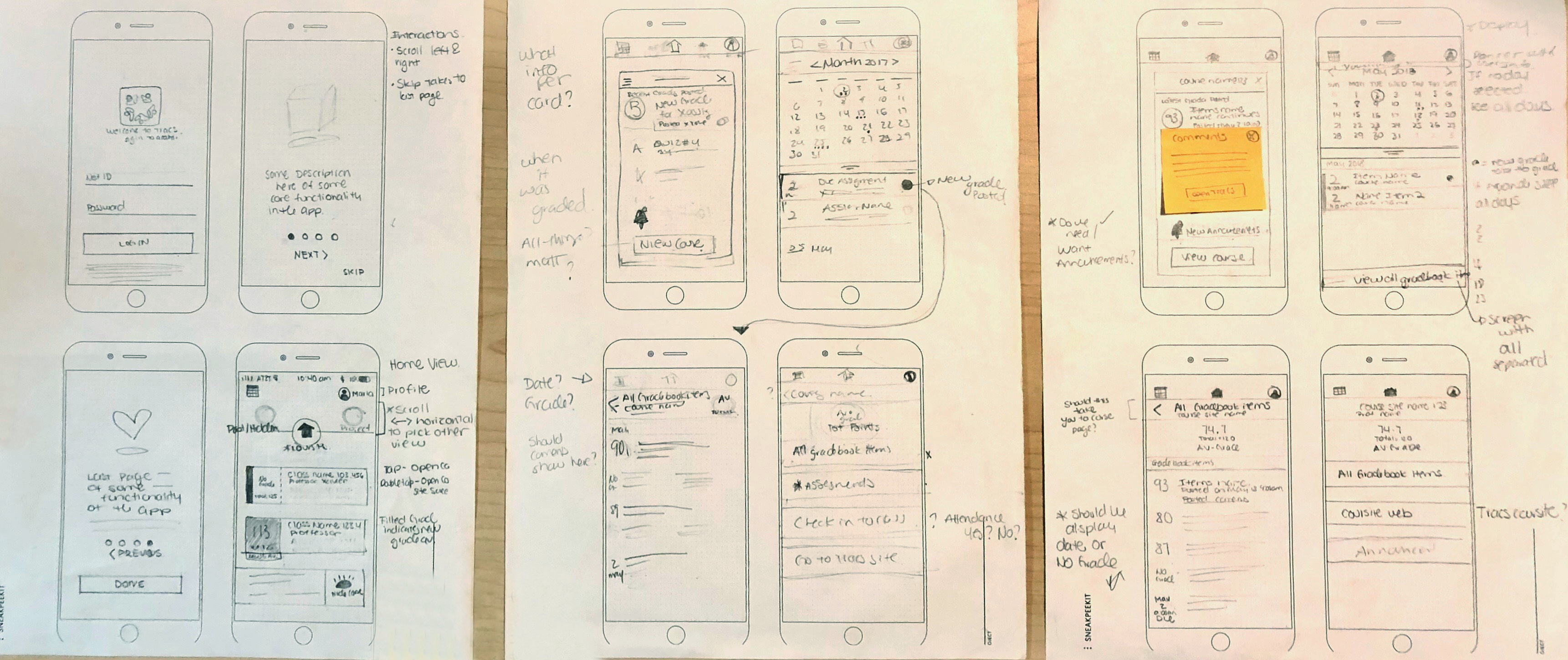
The initial stages of design were done on a paper wireframe, where I showed the team and users how the app could function and the flow of the screens.

From the pencil sketches, the developer started forming initial placeholder spaces in the app where functionality can be shown; speeding the process for development and design. This style of collaboration is the best for faster delivering of a product; since the developer does not have to wait for final design to deliver functionality. The designer can then quickly switch ideas if they encounter any system restrictions.
Prototype-User Testing
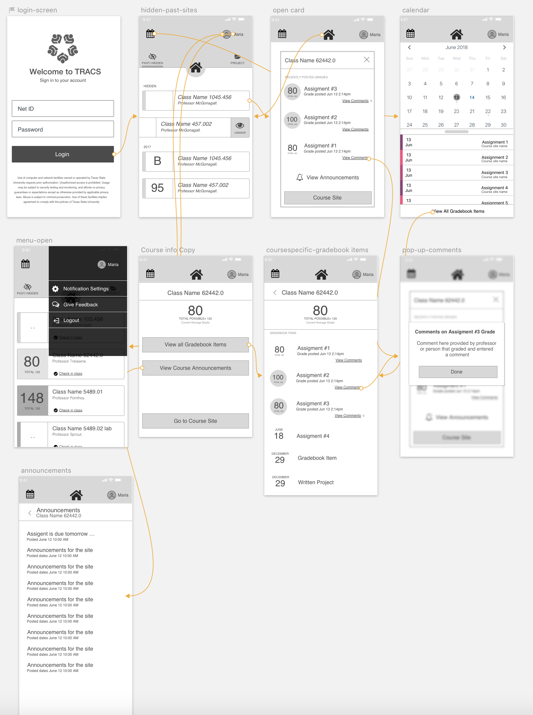
Using a simple click through prototype, we gathered some user feedback utilizing a class while collaborating with a professor where we were able to see how students will interact with the app. In the testing we ran through a list of tasks to see if any issues arose.
From the initial user feedback we made changes and adjusted some of the interactions that were difficult for users.
Collaboration with Devs
For this project, assets were delivered from a Sketch file by sending a cloud link for visual reference and communicating with the developer for desired interactions and visual details. In my experience the manner of delivering assets varies as to how the team would like to collaborate and the different skills of a developer. This project was done on React platform so the developer felt more comfortable at making elements and then collaborating to adjust to match design.

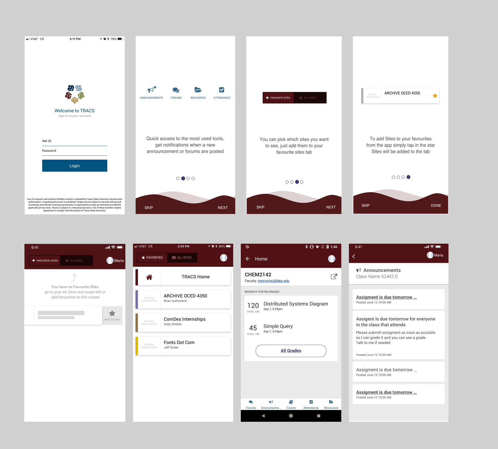
Final Design-Last User Testing
Before deploying the app a final pass at user testing was conducted with a different set of users. A second round of testing is always helpful for final touches and gathering more feedback.

The final app is set to deploy in October 31st
